

Klos App Design
Turing each virtual call into a fun and memorable experience.
Even close friends and long-time couples struggle with long-distance relationships, especially when daily conversations get monotonous and repetitive. The lack of shared physical experiences in long-distance leads to dissatisfaction and can even cause relationships to break apart.
Design Goals
Create a shared experience for couples
Make scheduling dates across time zones easy and fast

Research
Competitive analysis
Examining other apps in the dating and video call space uncovered some strengths and weaknesses to consider


User Interviews
When I'm going to bed, she's getting up. The different time zones make it tough to set up time to talk.
(FaceTime calls) can get old really fast. You run out of things to talk about quickly. Playing games together helps keep things fresh."
We try to celebrate important dates with gifts. I'll send her those edible arrangements, she'll send me food or some clothing I like.
User Personas
After user interviews were complete, I built a user persona for the target user.

Designs and Prototypes

The initial design was too complex with timers and rewards that confused users instead of delighting them.
My initial designs focused on gamifying the video call experience. These initial game designs included:
A question timer, points system, leaderboard, and prize system
These features were too complex and were confusing instead of fun. Further research of party games such as Love Languages, and Messenger Augmented Reality games led to a new streamlined party game that is:
Straightforward, requires little explanation, and users can start and end the games at any time.
After streamlining the game, I created a low fidelity prototype in Adobe XD for users to test:

An early prototype of the Klos app, uncovering issues with presentation and scheduling.
Feedback and Testing
After testing with users, three major issues were uncovered:
Question Categories presentation
Users were not sure how the questions were to be used when initially presented. Who can see which question? Are the questions shared? How many questions are there? Can we customize categories?
Scheduling and managing a date
Questions on how do couples find available time slot. How to sync your own calendar to the app? How to make a recurring event? How do you make impromptu changes to the schedule without sending a message?
Is this a dating app or do I know these people?
Users are not sure if the app is meant to connect brand new people, or if you already know the other contact. Ambiguous on who the audience is for the app.
Putting It Together
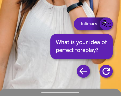
The Question Game
The first feature I finetuned was the Question Game
The Question Game is the main interaction for our long-distance couple (Jessica and Mark). The game is ready to play the moment the call starts, and requires no explanation. The couple can start asking questions and get the conversation flowing.
There are no gimmicks or cute tricks in the game. The amount of fun you have playing the Question Game is dependent on the person on the other side of the call.
For future development, custom questions and categories can be made by users in advance.

The Question Game is available for anyone during a video call
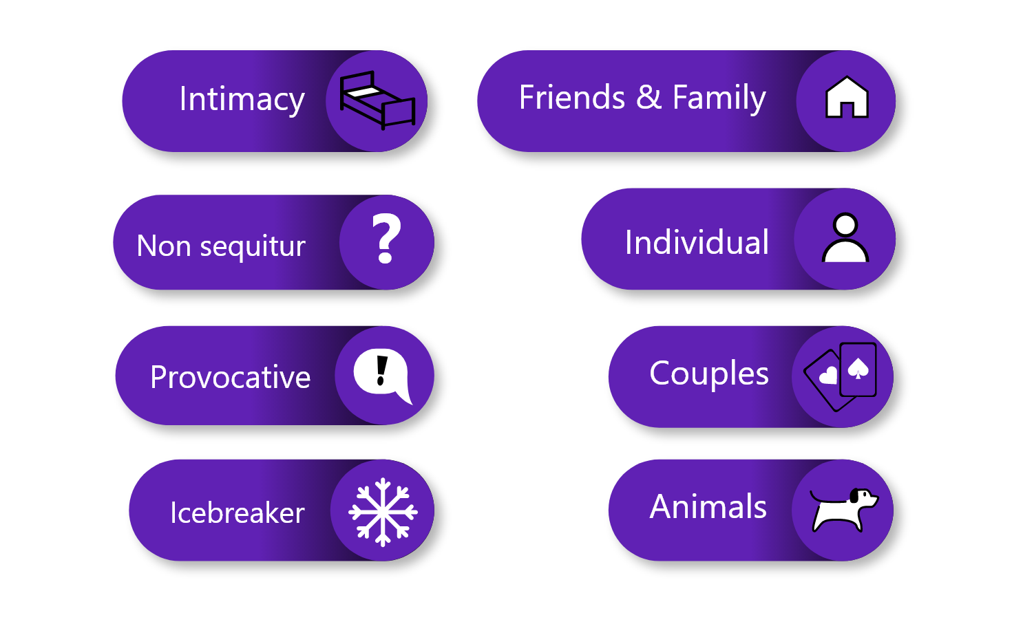
Categories for questions are endless. The common thread is that each category encourages users to learn about their partner and themselves.
An intimate question to get the imagination flowing!

Individual questions focus on the time spent alone, personal thoughts and beliefs

Friends & Family is about all the people around you that are important and meaningful

Couples questions help users dig into relationships
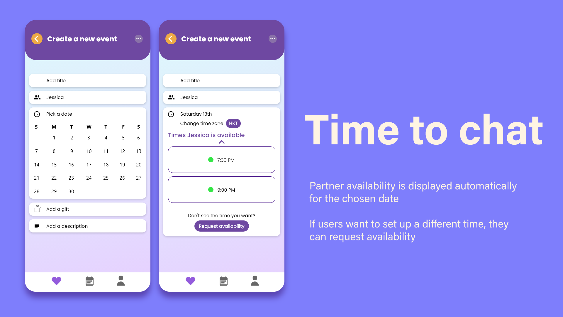
Scheduling a date
Finding time to chat with your partner can be tough, especially when you live in a different city. My objective with this design is to make the scheduling process intuitive, easy, and hopefully fun!
With this design, users can spend more time talking to each other and less time planning. Although, I’ve heard people say that waiting is half the fun…


Future Considerations
A few ideas that I wasn’t able to implement but I would like to take a stab in the future:
Incorporate a daily feed into the profile page
Similar to Instagram Stories or WeChat Feed, this feed will only be shared with the partner and helps couples stay connected asynchronously.
Relationship History page
A feature that lets users save everyday moments like screenshots, funny text messages, or weird gifs. These moments can be bundled up and shared with the partner to recall great memories together.
Daily Challenges and Badges
A daily challenge for couples to participate and discuss at the end of the day. Simple challenges like ‘who took the most steps?’ ‘who traveled furthest from home today?’ or ‘who ate the most unhealthy dinner?’
Things I learned
Consistency is king
I started building prototypes before I established a consistent design language. Consistency makes the product easier to scan, easier to learn, and reduces the user’s cognitive load. Take time to build a consistent language and style before jumping into prototypes and designs.
If you have to explain it, then you need to simplify it
Testing different game ideas and scheduling methods with users made me realize that the ideas that stick the most are the simplest to understand. Solutions should not make a users life more complicated, it should be elegant and streamlined. I found myself constantly explaining my ideas to users during testing, instead of users understanding the feature intuitively. A simple design is one that the user understands without having to look up a definition. These designs take practice and iteration and testing.